Nadia Harajuku Staffers w/ Blue Hair, Boy London, Cannabis & Vivienne Westwood

We met Yumi and Nonoco – staffers a the influential Harajuku boutique Nadia Flores En El Corazon (aka “Nadia”) – while they were on their lunch break. They are both stylish and friendly, as you would expect.

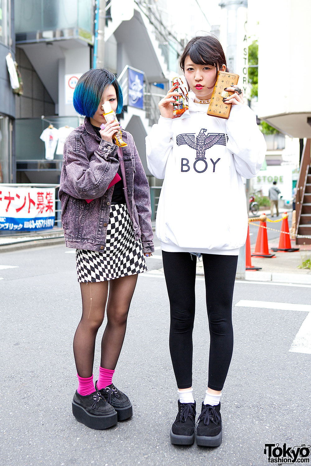
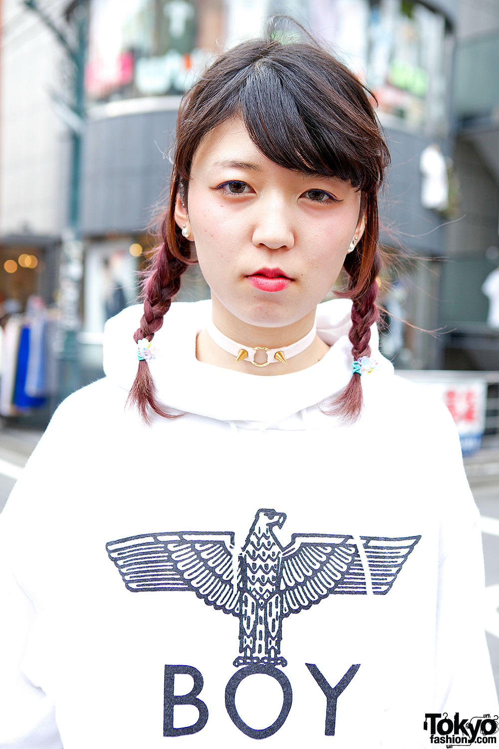
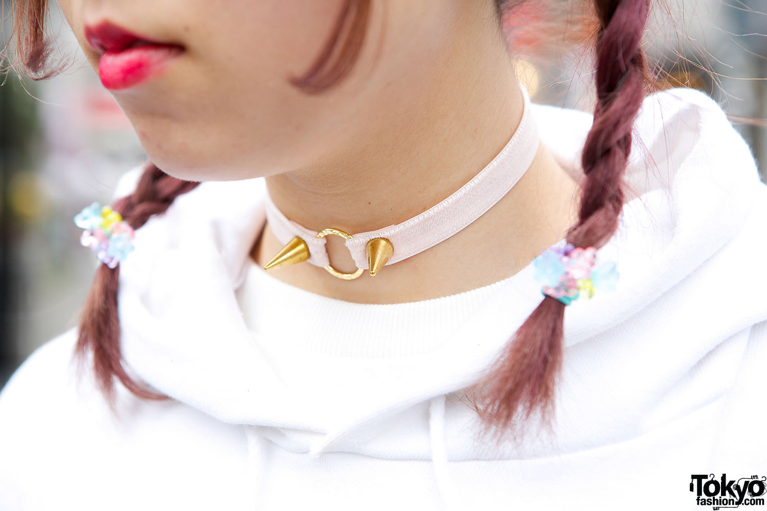
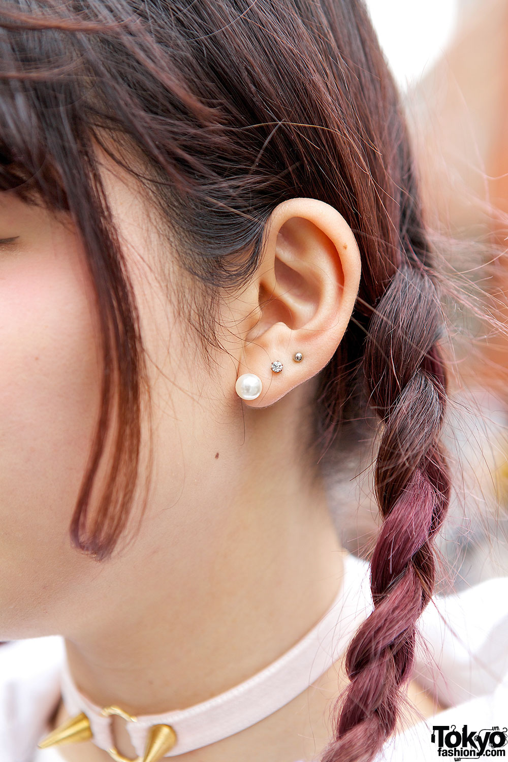
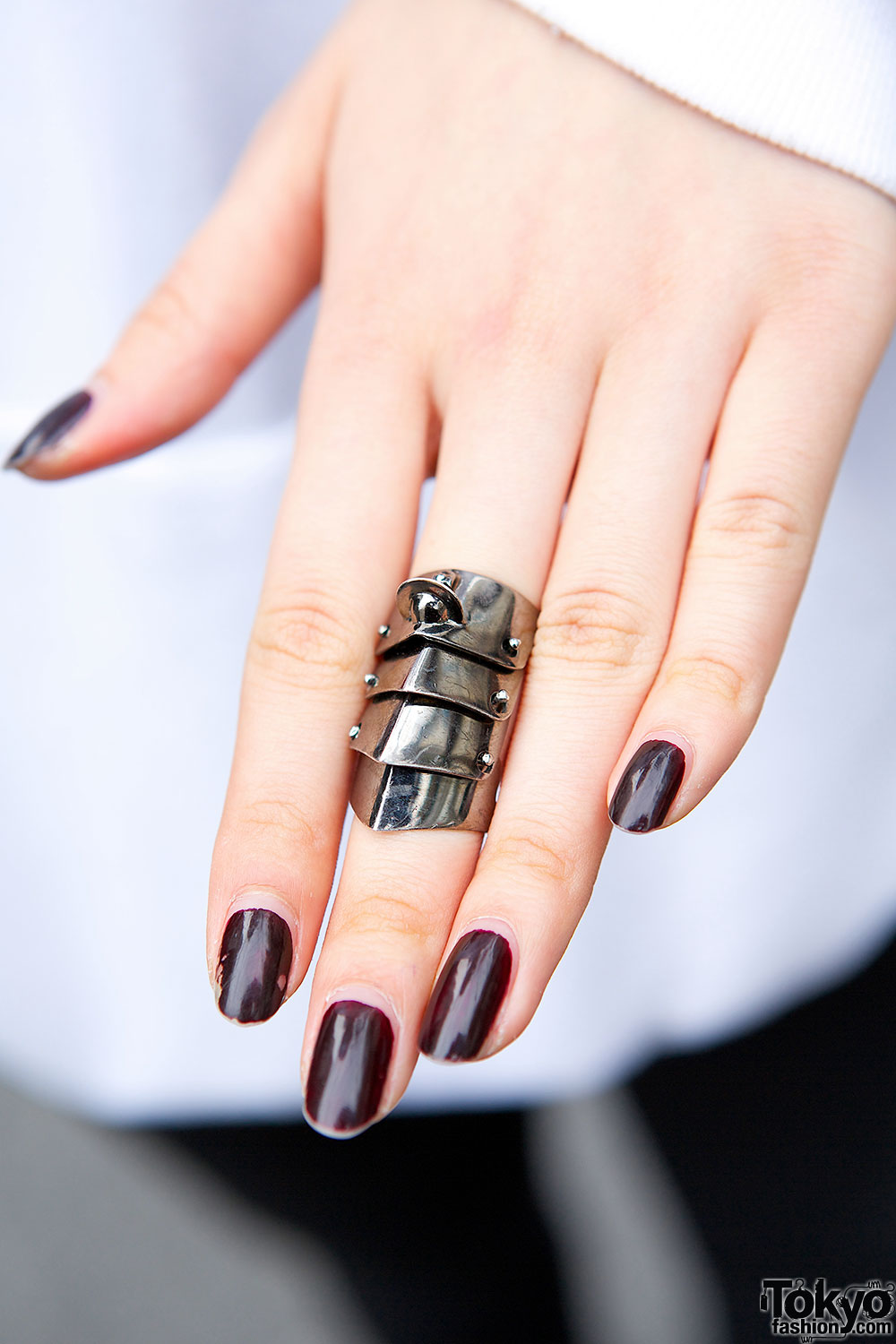
Yumi is the one in twin braids, wearing a Boy London sweatshirt with black leggings from Candy. She is wearing a Vivienne Westwood armor ring, stud earrings and a spike choker. Her platforms are Tokyo Bopper and her wallet is MCM. Yumi’s favorite designer is KTZ, and she’s active on Twitter if you want to look her up.

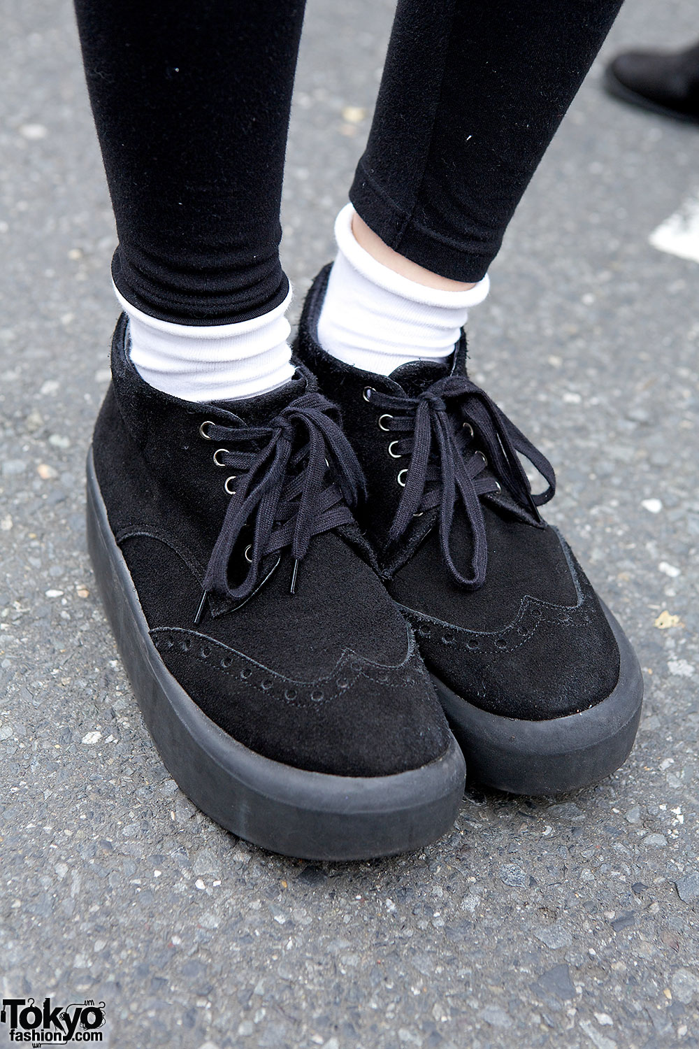
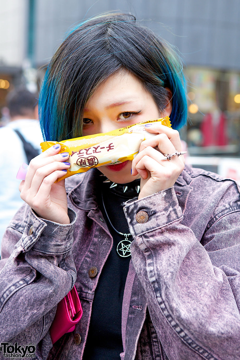
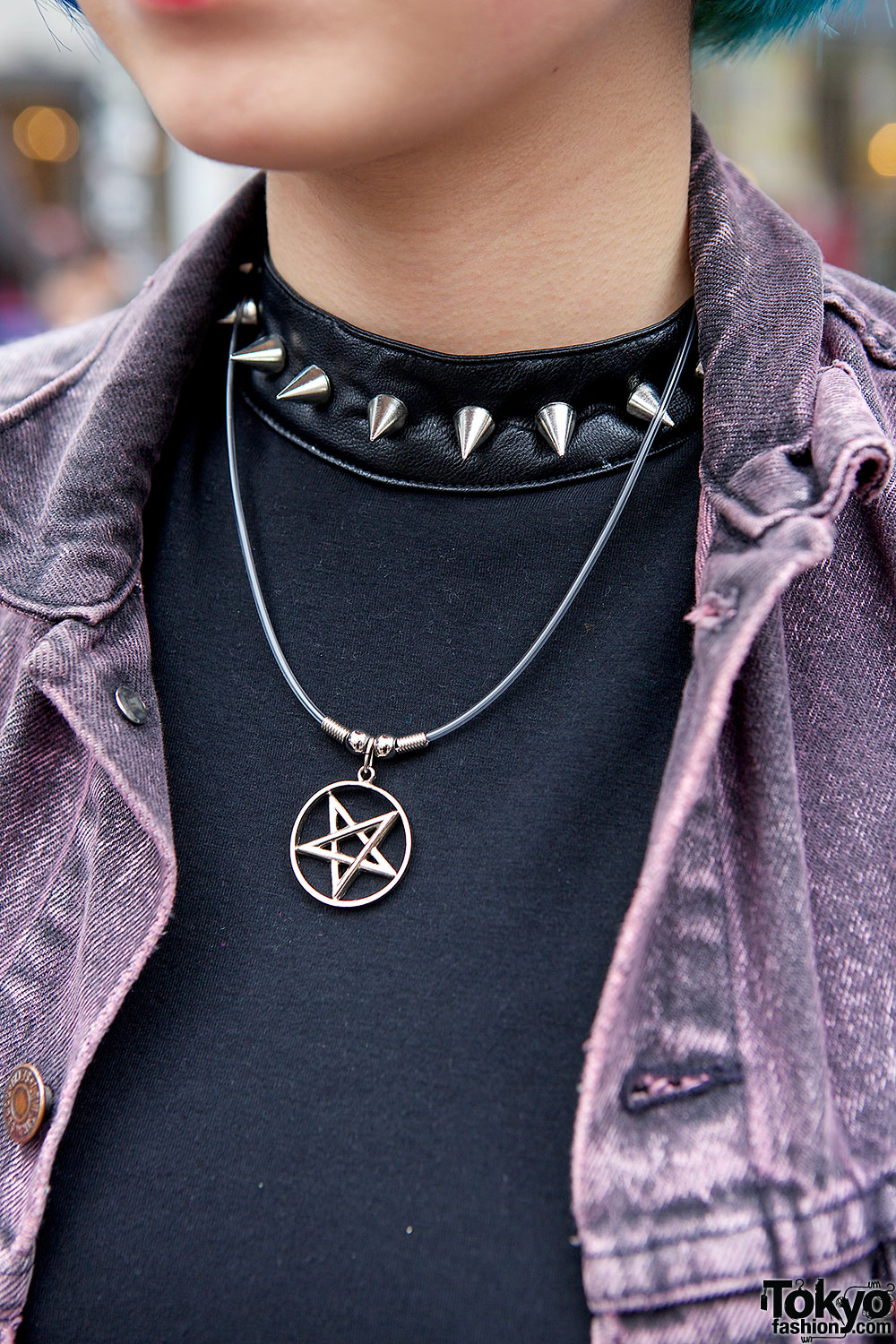
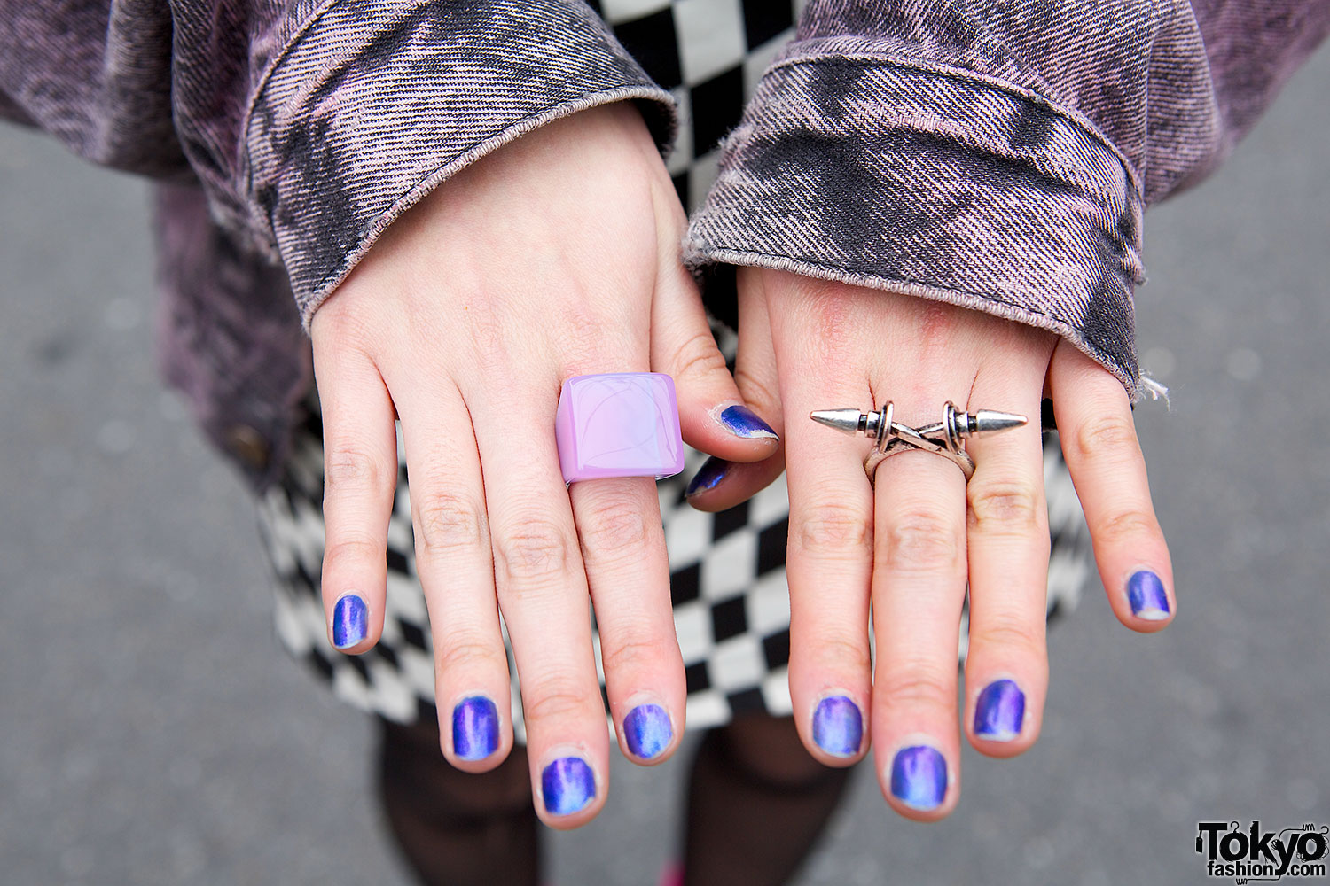
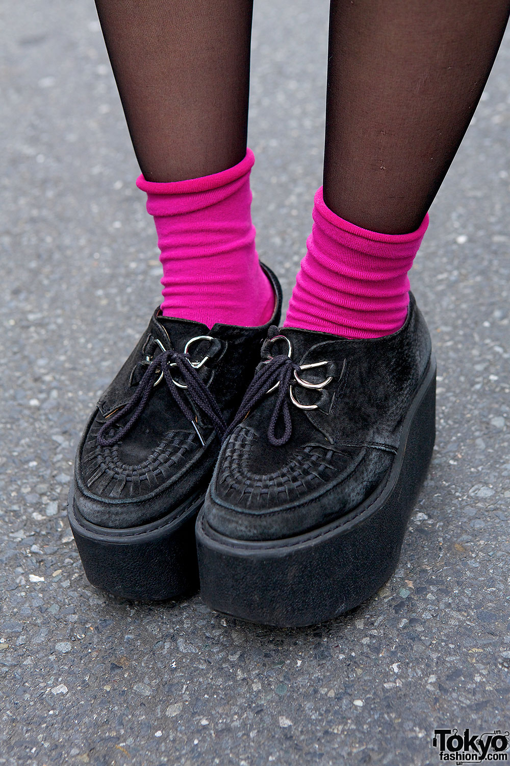
Nonoco is the one with blue highlights in her hair. She’s wearing a resale denim jacket in purple over a black top with a spiked collar, from Cannabis. Her checkered black and white skirt is a resale, as is her bag. Nonoco is also wearing creepers from Nadia Harajuku with pink socks, a plastic and a spike ring and a star necklace. She told us her accessories were bought from Bubbles.

Click on any photo to enlarge it.

Comments are closed.

  1. Oh please their looks are awesome ! One of my impossible dreams is to be able to work here, someday….

  2. I’ve seen tons of pics of people wearing those BOY sweaters and recently I even saw one crossing my path and I can’t believe I hadn’t even realized then that the logo actually uses a fascist symbol! It shows the Reichsadler (imperial eagle) and the O of BOY is where the Hakenkreuz is supposed to be in the symbol. Of course, it probably won’t interest Japanese youth much, or anyone else wearing hip and cool brand clothes, but I thought I’d spread the important info anyway.

  3. Dana, I think it’s amazing that you noticed this and post that comment. Fashion, like everything in this world, is unfortunately full of symbolism especially cool brands like BOY. And what’s actually absurd is that BOY doesn’t even have some special design. It’s just a simple print. :s
    Anyway, Nonoco’s hair is beautiful!

  4. Yeah, boy London is ridiculously expensive but if it’s on trend, it’s on trend… I agree that it looks really simple but I think that is what appeals to people who wear it.. The ”effortless” cool kind of thing. Personally I wouldn’t buy it just because it looks so simple, but I sort of get why everyone is so crazy about it haha

  5. ღAkyღ

    Indeed , BOY looks so cool because it’s simple, that’s what I like about it.

  6. perhosveitsi

    Dana, the BOY brand was originally designed by punk rockers. And you know what punk rockers like to do? Exactly, they like to shock people. So the logo doesn’t necessarily mean anything bad.